How to Use the YOOtheme Builder
Need more help? We’re here for you.
The YOOtheme Pro page builder allows you to create page layouts for your website with ready-to-use section, grid, and content elements. These elements can be easily added and arranged, while a preview screen allows you to see your changes visually and in real-time.
The layout library also provides a number of pre-built page layouts that can be used as a starting point. You can create a new page layout from scratch or import an existing layout from the Library.
Getting Started
After starting a new page or post, click the blue YOOtheme Builder button. (Prefer to use the Classic Editor?)
Tip: Remember to select the Save Page button each time you change the layout. If you cancel or leave the page builder, all layout changes since the last saving will be discarded.
Click the plus icon to add a new section, row, or element. You can edit sections and rows by clicking the pencil icon to edit sections and rows. Click on the element itself to edit it. Hovering over the element will show you the option to Copy, Save in Library, or Delete.
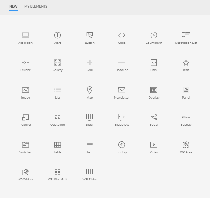
Elements

Each element contains individual settings to adjust style and display, as well as Advanced settings for additional functionality options.
Accordion: display a stacked list of items that can be expanded and “collapsed
Alert: display an error message
Button: display one or multiple buttons aligned horizontally
Code: display multiple lines of code in a preformatted text block
Countdown: display a countdown timer to a specific date
Description List: display a list with customizable descriptions
Divider: display a horizontal divider
Gallery: display multiple elements, typically images, within a grid format
Grid: display multiple Panel elements, including text and headlines, within a grid
Headline: display a headline
Html: insert custom HTML code
Icon: display a scalable vector icon
Image: display an image with an optional link
List: display a list of text with or without typographical symbols
Map: display a map with markers
Newsletter: display a newsletter signup form
Overlay: display an image with a content overlay
Panel: display text with an image optionally styled like a card
Popover: display an image with markers, which open popovers
Quotation: display a quotation
Slider: display an image slider of multiple images
Slideshow: display an image slideshow with navigation options
Social: display icons linking to social media accounts
Subnav: display a horizontal navigation
Switcher: display a tabbed navigation panel with transitions through content slides
Table: display a table
Text: add text and format using standard formatting options
To Top: display an icon that scrolls back to the top of the page on click
Video: display a local video or a YouTube or Vimeo video
WP Area: display a section from Widgets
WP Widget: display a specific widget
WSI Blog Grid: display a grid of blog posts or pages
WSI Slider: display an image slider of multiple images with customizable options
My Elements
To save one of your elements including its content and settings, hover over it and click the Save in Library button. The “My Elements” tab shows a list of your configured and saved elements with their content and settings. Click to load it into the current layout. Elements can also be renamed and/or deleted.
Last updated: July 2019